1. Let's open up a new file
File > New > Document
In the box that opens make sure the page size is the same size as you intend your finished print to be. We're not mind readers - if you set your page at A4 but want A5 leaflets either you or us will have to resize the file. We charge a minimum of £25 for this.
 A handy list of paper sizes can be found here.
Before you leave this box, remember to add 3mm for bleed. Simply type '3 mm' into the Top, Bottom, Inside and Outside boxes. Now when your new file opens there will be an additional 3mm around the edge of the page. Your images and background colour should be extended into this area to make the necessary bleed. The bleed area on InDesign is shown by the outer red/pink line.(More on this later).
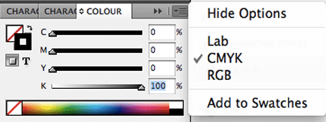
 2. Make sure the document is in cmyk mode
Window > Colour
Check the Colour Menu to confirm or change this.
Click the small arrow in the top right hand corner to change setting.
Now all new text and coloured backgrounds created in your page will be assigned a CMYK value.
 3. All images should be saved at 300dpi.
During the editing process in Photoshop, open your images, then choose:
Image > Image Size > Resolution : Set to "300"
Save in Photoshop at 300dpi and at least the physical size they will be when printed to ensure images are crisp and not pixelated or out of focus. SO, if your image will fill an A4 page when it's printed it should really be at least A4 in it's original form.
There are plenty of websites providing free high-res images.
PLEASE NOTE: If your images are less than 300dpi at the size they will be printed at then it is not possible to improve the quality. You should either make the images smaller in your book or use higher quality versions.
 Will it be ok to include lo res images?
Ultimately it is your call but we recommend you always use hires images if possible.
The image on the left here is at 300dpi. The image on the right is only 72dpi, blurred and not very crisp. We always preflight every file before going to print and try to advise when you have included lo res images. Anything under 300ppi can appear out of focus or pixelated when printed. We strongly recommend dropping in hi res replacements if you have them to ensure the finished printing is crisp, high quality and professional.
 4. All images should be in CMYK for printing
There are two ways to do this: You can change them all individually in Photoshop.
Image > Mode > CMYK Color
Images will be RGB when you saved them onto your computer from your camera or the internet. Open them in Photoshop or any other photo editing program and resave as CMYK.
OR...the easiest way for you to convert them all in one go is when you export your final files to PDF choose 'PDFX/1a' from the top drop down menu and that will automatically convert the whole file to CMYK. It will save you doing them one by one in Photoshop. Once the PDF is exported then have a good check through and make sure none of the colours have changed too dramatically.
Screen v Print
Unfortunately what you see on an rgb, backlit screen is NEVER going to be the same as it appears on paper when printed in cmyk. It's just impossible to achieve complete accuracy and no printer will be able to. You will have to allow for some difference in the colours between the two mediums but the great thing is that having something tangible in your hands and seeing your work on paper has a charm that just sending out a pdf simply doesn't.
 Bringing your images into InDesign
Once images are saved as 300dpi and CMYK you can go ahead and use them in InDesign. Drag a new image box onto your artwork (it's the rectangle with the cross over it on the Tool Bar), position it where you'd like it then hold Command-D to select the image or go to File>Place then choose the image you'd like from your computer. Selecting the black arrow will help you move the whole image box. Using the white arrow tool enables you to move the image within the image box.
The InDesign Links Menu is then a handy and quick way of checking the set up of any images in your artwork.
Window > Links
Notice on the Links Menu (right) our images are 300ppi but their Effective ppi is 475 which means they are being used smaller than the physical size of the image so the quality is even better.
If you are concerned about how some images or colours in your artwork will print then we can run a hard copy proof for a final check. This will add an extra 2 or 3 days to the turnaround so be sure to leave enough time.
 **PRO TIP**
There is a second easy way to check what is lo res at the moment and needs converting:
Open Acrobat - Open Your File - Choose 'Advanced' menu - then 'Print Production' - then 'Preflight' - Choose 'Sheet Fed Offset (CMYK)'. This runs a check on the file and will list all of the images in your document that are under 150dpi. Ideally you want to find improved images for all the images that are coming up in the list. If you click the arrow to open up all the instances and then choose 'Show in Snap' (in the bottom left corner) the preflight report will show you which images are the suspect ones. Anything under 300ppi can appear out of focus or pixelated when printed. We strongly recommend dropping in hi res replacements if you have them to ensure the finished printing is crisp and high quality.
 5.Adding black text
When typing any black text always set it as C0 M0 Y0 K100 on the CMYK slider. This means only one ink colour (black) goes into printing your text. This is a better solution than setting the text in a four colour black because the press would then have to align four colours to make the same text (this can lead to colour ghosting). Stick with 0/0/0/100.
 6.Black backgrounds on your artwork
However, if you want a nice, rich black as a background or colour box then use the cmyk setting: 30/30/30/100. By adding 30% cyan, 30% magenta and 30% yellow behind your 100% black will make the black more punchy. Although 0/0/0/100 is great for text is makes the black look flat and charcoal on larger areas.
 7. Pages need 3mm bleed on each edge.
This is the single biggest issue we face every day with artwork that comes in. The image on the left HAS bleed, the right hand example is missing bleed.
'Bleed' is the technical term for an additional area of content around your artwork file. If you intend your images to go right up to the edge of your printed pages then you need to add an extra 3mm on all four edges of your artwork. The extra 3mm gives us some room for movement when the sheets are trimmed. If the paper moves slightly then the extra 3mm means there is content there for us to trim into rather than just blank paper. Without adding bleed you will be left with an unwanted white border where the image stops - this looks unprofessional and like a mistake.
When designing your file, simply extend any images or background colour beyond the page edge (the pink line) by 3mm like the examples here. There is bleed on the left hand example and you can see the image extends beyond the pink out to the magenta bleed. There is not bleed however on the right hand example where the image stops at the trimmed edge of the page. Easy? Hope so, if not give us a shout and we'll talk you through it.
The following videos might also help (they are from external sites so we did not produce them and none of these 'cool' characters work for Ex Why Zed).
https://www.youtube.com/watch?v=ZD8NGwgxL1c
https://www.youtube.com/watch?v=ZuNrmgv8rjQ
https://www.youtube.com/watch?v=0s0HgYGuV10
PLEASE NOTE: If you have a white background on your artwork file or you intend your images to have a nice, generous 15mm border of white space around them then you do not need to worry about bleed because none of your content will be going to the edge of your finished book's pages.
 Including bleed on your PDF
Great, so you've added bleed to the InDesign artwork, now you need to add it when you export to pdf.
Choose File > Export > "Enter your chosen file name", in the 'Format' box at the bottom choose Adobe PDF (Print) then Save.
An 'Export Adobe Pdf' box will now appear.
Choose 'PDF/X-1a:2001'from the top 'Adobe PDF Present' menu.
On the left, scroll down to the 'Marks and Bleeds' menu.
Tick 'Crop Marks'. Don't worry about bleed marks or colour bars just tick Crop Marks.
At the bottom of that page, add '3mm' into the four Bleed boxes.
(When you click crop marks you are changing the default settings so it will now read '[PDF/X1a:2001] (modified)' on the top menu. This is fine and nothing to worry about.
Then click 'Export' and your file will be saved as a print ready pdf.
 What should my finished pdf look like?
The exported pdf should look like the example here on the right. The crop marks show where we will trim the print and you can see the image is extended 3mm beyond the marks giving us the extra scope we need for trimming.
 My file doesn't have bleed, what should I do?
You'll notice on this example that the artwork stops at the crop marks - there is no bleed. The photo (or your background colour) needs to extend 3mm beyond this to avoid any chance of a white border.
If your exported PDF looks like this then you'll need to export it again. You might have set this up correctly in InDesign but when you export to PDF just make sure that in the 'Marks and Bleeds' menu you not only tick 'Crop Marks' but you also add '3mm' in to the four bleed boxes - top, bottom, inside and outside. This will add the bleed to the exported PDF if you have set it up correctly in InDesign.
**PRO TIP**
HOW TO FIX YOUR BLEED ISSUES
You need to change one of two things:
Have you dragged the background image out 3mm beyond the black line on your Indesign file into the bleed area? Try that then export again.
OR you have done the above but then when you're exporting you need to click the Marks and Bleeds menu, then type '3mm' into the four bleed boxes. This will add the bleed to the pdf.
 MORE PRO TIPS
PRINTING ON TO UNCOATED PAPER: LITHO VERSUS DIGITAL (remember, it is digital printing for under 700 copies so this might not apply to you)
When you come to artwork images for uncoated paper it's always best to keep them bright, punchy and full of contrast. Printing on uncoated paper looks and feels great as you've seen from our samples and portfolio but the ink does soak in and flatten colours. To illustrate this please find attached a set of images for a recent Lookbook job we printed. These are exactly the same files and artwork used for both however one is onto silk and the other uncoated. Feel free to send over a work in progress file if you'd like us to check it through and offer some further advice. If colour repro is crucial then we'd lead you towards the silk version :)
SET UP A FILE FOR FOILING
We'll need a second artwork file for the foiling-anything that you would like foiled should be set in 100% black (0/0/0/100 on the cmyk slider). This file should be the same size as the cover A4 so that we can overlay the two. Foiling only works with vector artwork so best to produce that in Illustrator for optimum results.
SET UP A FILE FOR SPOT UV
We'll need a second artwork file for the varnishing-anything that you would like varnished should be set in 100% black (0/0/0/100 on the cmyk slider). This file should be the same size as the cover A4 so that we can overlay the two. Varnishing works best with vector artwork so best to produce that in Illustrator for optimum results.
SET UP A FILE FOR EMBOSSING
We'll need a second artwork file for the embossing-anything that you would like embossed should be set in 100% black (0/0/0/100 on the cmyk slider). This file should be the same size as the printed artwork so that we can overlay the two. Embossing only works with vector artwork so best to produce that in Illustrator for optimum results.
If you need further information and advise then DOWNLOAD the Professional Publishers Association Guide to creating perfect files for print